Hello Tailwind CSS! Goodbye Pure CSS
I recently decided to give this blog a much-needed makeover. In the past, I relied on Pure CSS for its responsive CSS modules, but I felt it was time for a change. After some research, I stumbled upon Tailwind CSS and decided to give it a try.
Experimenting with Bulma #
Before settling on Tailwind CSS, I initially experimented with Bulma, another popular CSS framework. Bulma provides a set of ready-to-use frontend components that can be easily combined to build responsive web interfaces. However, I quickly ran into a show stopper. How do I override the colors in the dark theme? If I use a bright color for the primary color of the light theme, I don’t want to use that same color in my dark theme, as it would be too harsh on the eyes at night. Unfortunately, after posting my question in the Bulma community, it remained unanswered for over a month. This lack of interaction made me realize that either the question was too challenging to answer or the community wasn’t as active as I had hoped.
Embracing Tailwind CSS #
Frustrated with the lack of progress, I decided to explore Tailwind CSS. To my surprise, Tailwind CSS covered all my needs and more. What really won me over was its composition over inheritance philosophy. Unlike frameworks like Bulma and Bootstrap, which rely on predefined classes for elements like buttons and tables, Tailwind CSS takes a different approach. It provides a set of utility classes that you can compose to build your own custom designs. This flexibility allows for greater control and customization of your website’s appearance.
Hello, Dark Mode! #
One of the exciting features I implemented with Tailwind CSS is support for dark mode. Now, visitors can switch between light and dark themes, enhancing their reading experience based on their preferences or the time of day. Implementing dark mode with Tailwind CSS was a breeze. By leveraging its utility classes, I could easily define different styles for the light and dark themes. This allowed me to choose appropriate colors and ensure optimal readability in both modes. Sure, I might not have a huge audience for my blog yet, but I believe in creating a pleasant experience for every visitor, even if it’s just me!
In memory of my old layout #
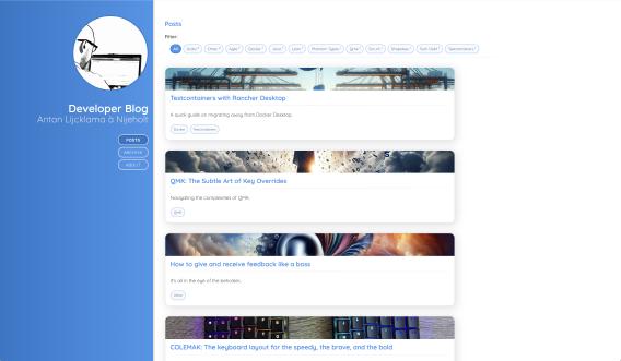
As an image is worth a 1000 words, hereby my lovely old layout that ceases to exist today. You served me well for many years, but now the time has come to say goodbye…

Conclusion #
Giving my developer blog a makeover with Tailwind CSS has been a rewarding experience. While Bulma initially caught my attention, the lack of community support and the difficulty in customizing the dark theme led me to explore other options. Tailwind CSS proved to be the perfect fit for my needs. Its composition-based approach and extensive utility classes empowered me to create a unique and visually appealing design. Plus, the ease of implementing dark mode support was a huge bonus.
If you’re considering a makeover for your own website or blog, I highly recommend giving Tailwind CSS a try. Its flexibility and extensive documentation make it a joy to work with, and the results speak for themselves. Now, if you’ll excuse me, I’m off to admire my blog’s new look and maybe even write a new post to showcase it!
Posted on Jun 2, 2024 (updated on Sep 6, 2025)

